


Defining a room with paint: techniques and advice
In an open-plan interior, the challenge of defining separate zones becomes pressing. Paint, as simple as it is powerful, lets you reshape volumes without altering the structure. Playing with contrasts or tone-on-tone harmonies grants creative freedom to delineate a dining nook, a home office, or a relaxation area. Let the interplay of light and shade guide your hand, as strategic colour choices transform how you perceive the space, lending a sense of flow and intimacy. The result is a layout that feels both seamless and distinctly yours, where each area breathes with its own quiet character.
Defining a room with paint is far more than a simple decorative trick; it's a powerful and accessible interior design strategy to redefine volumes, create distinct atmospheres, and add character to an open space. In a world dominated by open plans, the need to create functional and intimate zones without resorting to physical partitions has never been more pressing. Paint, with its infinite palette of colors, finishes, and techniques, offers an elegant and economical solution. This article guides you through all facets of this method, from fundamental concepts to the latest trends, so you can master the art of defining space with brilliance.
The Fundamentals: Why Define with Paint?
Before diving into the "how," it's essential to understand the "why." Defining a room with paint addresses both aesthetic and functional needs. Aesthetically, it breaks the monotony of a large volume, draws the eye to an architectural element, or creates a spectacular focal point. Functionally, it helps organize space into dedicated zones: a dining area distinct from the living room, a defined office space in a bedroom, or an entryway that makes a statement from the moment you step inside.
Unlike a partition wall, defining with paint preserves fluidity and natural light. It adds depth and can even, through optical illusions, visually enlarge a room or raise its ceilings. It's a non-permanent design tool, offering valuable flexibility for those who love to evolve their interior or for renters concerned about avoiding major renovations.
Strategic Color Choice: The Foundation of Any Definition
Color is the most obvious and impactful element for creating visual separation. The choice is not random; it should be guided by the desired effect, the room's brightness, and overall harmony.
Contrast, King of Definition
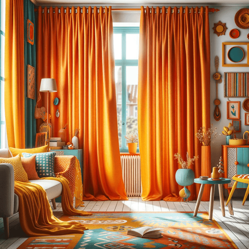
For a sharp and dynamic separation, play with contrasts. Pairing a dark wall with light walls immediately creates a strong visual boundary. Current trends see the emergence of subtle yet effective contrasts, like a deep warm grey against sand tones, or an aqua blue highlighted by off-white walls. Contrast isn't solely about tone; it can also play on color temperature (warm vs. cool) or intensity (vibrant colors vs. neutrals).
Tone-on-Tone Harmonies for a Soft Transition
If you're looking for a softer, more sophisticated definition, tone-on-tone harmony is ideal. This involves using different shades from the same color family. For example, painting one wall in a deeper version of the room's dominant color. This method creates an elegant separation without a harsh break, perfect for spaces where you want a cozy and unified ambiance. Gradients of beige, grey, or even sage green are very popular right now.
The Psychological Impact of Colors
Don't forget that each color influences the mood. Use this power to reinforce the function of each zone. A calming blue can define a reading nook, while an energizing yellow can invigorate a play or creativity space. In an open space, a stimulating color like coral or emerald green can mark the living area, while a soft neutral will define the relaxation zone.
Painting Techniques to Structure Space
Once the palette is chosen, the way you apply the paint becomes crucial. Several techniques are available, each with its own visual language.
The Accent Wall: The Unbeatable Classic
Painting a single wall a different color is the most common method for defining a zone. For it to be effective, choose the most logical wall: often the one in the line of sight upon entering, the one that hosts the headboard, sofa, or an architectural element like a fireplace. 2026 trends see the return of the textured accent wall, where paint is combined with plaster or material effects to add a tactile dimension to the definition.
The Horizontal Stripe or Chair Rail
Painting a horizontal stripe, at mid-height or in the upper third of the wall, is a technique inherited from Victorian interiors making a strong comeback. It allows you to "break" the height of a wall, create a visual anchor, and clearly define two superimposed spaces. In a child's room, the lower stripe can define the play area, while the upper part remains the rest space. Use quality painter's tape for a perfectly crisp line, essential for this technique's effectiveness.
Geometric Shapes and Arches
Geometric painting has become a pillar of contemporary decor for defining space in a graphic and original way. It's no longer just about rectangles. Paint a half-circle (or an arch) behind a sofa to create a living room "cocoon," or a rectangle aligned with a table to define the dining area. Organic shapes and curves, very trendy, soften the space and add an artistic touch. This technique requires more preparation (laser level, stencils) but the result is spectacular and personalized.
Ceiling Paint: The Fifth Surface
Neglecting the ceiling is a mistake. Painting a portion of the ceiling, or the entire ceiling above a specific zone, is a bold and extremely effective method for defining from above. Imagine a ceiling painted midnight blue above the bed, creating a celestial alcove, or a soft color on the dining nook ceiling to frame it. This technique visually lowers the ceiling and makes the space more intimate and defined.
Defining Specific Rooms: Concrete Examples and Trends
In a Studio or Open-Plan T2 Apartment
The challenge is significant: create the illusion of multiple rooms. A winning strategy involves using two combined techniques. For example, painting a deep accent wall (navy blue, forest green) behind the sofa for the living area, and using a **horizontal stripe** or a different color on the adjacent wall to mark the kitchen or dining area. Use the same accent color in subtle touches (cushions, accessories) in the other zone to create a visual link and avoid a patchwork feel.
In the Living Room: Creating an Office Nook or Library
With remote work, defining an office space in the living room is essential. Paint can create a "room within a room." Paint the office wall up to the ceiling in a focusing but not anxiety-inducing color, like a grey-green or matte terracotta. For a softer integration, paint only a wide vertical stripe or a rectangular shape behind the shelf and desk. Dark, satin finishes help mentally "close" this workspace at the end of the day.
In the Bedroom: Separating the Sleep Area from the Dressing Room or Relaxation Nook
In a master suite, use paint to define the dressing area without a door. A lighter, brighter color (white, cream) in the dressing room reflects light, while the sleeping area can be dressed in a more enveloping color. The arched shape technique behind the headboard is perfect for anchoring the sleep space and giving it architectural importance.
Beyond Color: The Crucial Role of Finishes and Effects
Definition isn't just about hue. The texture and sheen of paint are underrated but powerful allies.
Play with finishes: a matte paint absorbs light and gives depth, ideal for an accent wall you want to recede. A satin or glossy finish reflects light and brings a wall forward. Imagine defining a hallway with vertical stripes alternating matte and satin in the same color: the effect of relief and movement is immediate.
Special effects are experiencing a revival. Limewash paint, suede or metallic effects, or paints with reflective micro-pigments create a subtle definition that reveals itself with changing light. It's a sensory and sophisticated approach to separating spaces.
Preparation and Execution: Key Steps for a Professional Result
A beautiful project can be ruined by poor execution. Preparation is paramount.
- Cleaning and Patching: Walls must be impeccable. Any imperfection will be amplified by the play of colors.
- Establishing Crisp Demarcation Lines: Whether for a stripe or a geometric shape, use a laser level and painter's tape (like FrogTape) to get perfect edges. Press the tape down firmly and lightly paint over its edges with the base color to seal the barrier and prevent bleeding.
- Tool Choice: For large surfaces, a medium-nap roller. For details and edges, quality flat brushes. For complex shapes, angled brushes or foam rollers.
- Number of Coats: Always plan for at least two coats, especially when going from a light to a dark color. Let dry completely between each coat.
Harmonizing the Whole: Furniture, Lighting, and Accessories
Defining paint doesn't live alone. For the magic to work, it must dialogue with the rest of the room.
Furniture should be positioned to reinforce the definition. A sofa backed against the accent wall anchors it. A rug sized to the painted zone on the floor reinforces the perimeter. Lighting is crucial: a ceiling light or pendant centered on the painted zone illuminates and visually isolates it from the rest. Use accent lamps to create pools of light in each defined zone.
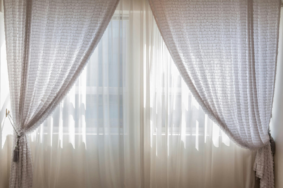
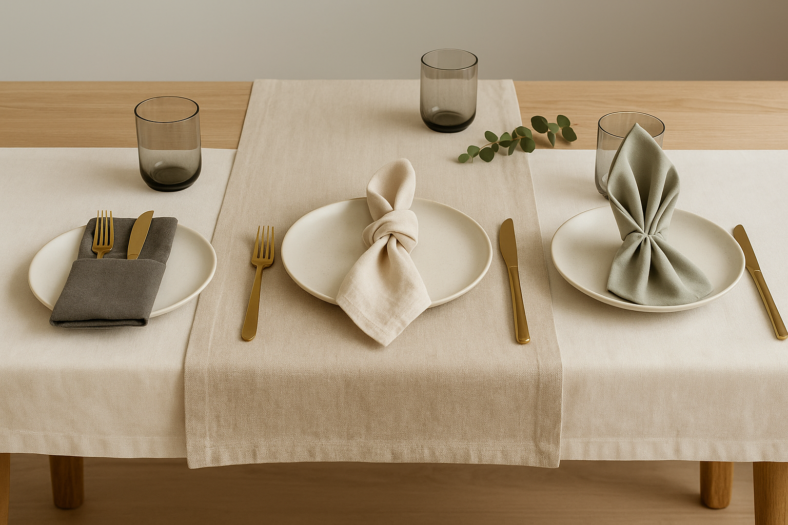
Accessories and wall art are the final cement. Hang artwork or a mirror on the accent wall to make it the focal point. Choose textiles (curtains, throws) that echo, either in contrast or harmony, with the defining colors.
Current Trends in Defining with Paint
The landscape is evolving rapidly. Here's what defines the contemporary approach.
- Natural and Earthy Colors: Ochres, siennas, moss greens, and chocolate browns are favored for creating warm, grounded definitions.
- Gradients (Ombre Painting): The reigning technique of the moment, it involves fading a color towards the top or bottom of the wall, creating a soft, poetic boundary. Perfect for a gentle effect without harsh contrast.
- "Color Drenching": This radical trend involves painting all elements of a zone (walls, ceiling, trim, radiators) in the same saturated color. This creates total immersion and an extremely strong, immersive definition.
- Vertical Stripes: A modern alternative to horizontal stripes, they energize the space and can make ceilings appear higher.
FAQ: Answers to the Most Frequent Questions
What is the best color to visually enlarge a room while defining it?
Light, cool colors (pale blues, aqua greens, very light greys) tend to recede walls. To define without shrinking, use one of these hues on the wall farthest from the window, creating perspective. Pair it with even lighter side walls (bright white) to maximize the depth effect. The definition is created by the difference in brightness rather than a strong contrast.
Can this technique be used in a small space or will it fragment it too much?
Absolutely, but with subtlety. In a small space, avoid overly violent contrasts that can indeed fragment it. Opt for tone-on-tone harmony or definition by texture/finish. A horizontal stripe at mid-height in a slightly darker shade can structure the space without crushing it. The goal is to create order, not division.
How to define a space without a physical wall (in a loft)?
This is where creativity comes into play. You can use paint on the floor (on part of the parquet, with suitable paint) or on the ceiling, as mentioned. Another idea: paint a wide "column" or vertical shape that starts from the floor and goes partially up the wall and/or ceiling, like a fictitious architectural element. This defines a perimeter without needing a full wall.
Should proportion rules (like the 60-30-10 rule) be followed?
The 60-30-10 rule (60% dominant color, 30% secondary color, 10% accent) is an excellent guide for color balance. In a definition, the color of the defined zone can represent the 30% or even 10% if it's very localized (geometric shape behind a shelf). Respecting these proportions ensures harmony and prevents one color from overwhelming the entire space.
How to ensure a successful transition between two strong colors on the same wall?
For a crisp transition (horizontal stripe), quality painter's tape is essential. For a soft transition (gradient), the "wet-on-wet" technique is required: apply the two colors in parallel bands then blend the border with a dry brush or damp sponge before the paint dries. This is a technique that requires practice on a test panel.
Conclusion: Dare to Redraw Your Space
Defining a room with paint is one of the most rewarding interventions in interior decoration. It combines artistic creativity with practical solutions, all with a controlled budget. Whether you opt for a bold contrast, a trendy organic shape, or a subtle play of textures, this method allows you to deeply personalize your living space and optimize its function. Don't be afraid to test large-scale samples on the walls and observe the light at different times of the day. Your home is your canvas; paint is your brush. To discover more inspiration and practical guides on transforming your interior, explore the many resources available on ombreinterieur.fr. To go further, try Rideau Voilage Avec Motif in your room. Need practical advice? Read how to arrange an entryway with a pastel blue sconce. Visit ombreinterieur.fr to explore the entire catalog.