
🚚 Free delivery! Right to your door or to a pickup point! 💨
🧵 Customize your curtains with different sizes and tiebacks. 🎨
♻️ Each order supports reforestation. For a greener future! 🌱

-
All types
-
Abat jour pour applique murale
-
Abat-jour
-
Abat-jour lampe de chevet
-
Accessoire Automobile
-
Accessoire Déco Halloween
-
Accessoire Décoratif
-
Accessoire Décoratif Halloween
-
Accessoire Décoratif Noël
-
Accessoire Décoratif Textile
-
Accessoire Rideau
-
Accessoire Salle de Bain
-
Accessoire Voiture
-
Accessoire bébé
-
Accessoire cadre photo
-
Accessoire d'éclairage LED
-
Accessoire d'éclairage extérieur
-
Accessoire de Décoration
-
Accessoire de Décoration Automobile
-
Accessoire de Décoration de Fête
-
Accessoire de Lit
-
Accessoire de Literie
-
Accessoire de Salle de Bain
-
Accessoire de Suspension
-
Accessoire de Table
-
Accessoire de Village de Noël
-
Accessoire de cuisine
-
Accessoire de cuisine et décoration
-
Accessoire de décoration DIY
-
Accessoire de décoration Zen
-
Accessoire de décoration de gâteau
-
Accessoire de décoration de table
-
Accessoire de fixation mural
-
Accessoire de fixation pour meuble
-
Accessoire de fixation pour voile d'ombrage
-
Accessoire de lit
-
Accessoire de literie
-
Accessoire de luminaire
-
Accessoire de porte
-
Accessoire de poterie
-
Accessoire de rangement
-
Accessoire de rangement salle de bain
-
Accessoire de rideau
-
Accessoire de salle de bain
-
Accessoire de table
-
Accessoire luminaire
-
Accessoire luxe salle de bain
-
Accessoire mural décoratif
-
Accessoire photo
-
Accessoire photomaton
-
Accessoire pour Rideau
-
Accessoire pour animaux
-
Accessoire pour ballon
-
Accessoire pour linge de lit
-
Accessoire pour plante d'intérieur
-
Accessoire pour rideau
-
Accessoire pour rideau de voiture
-
Accessoire pour rideaux
-
Accessoire pour voile d'ombrage
-
Accessoire salle de bain
-
Accessoire salle de bain en bambou
-
Accessoire voile d'ombrage
-
Accessoire éclairage LED
-
Accessoires Déco Village de Noël
-
Accessoires d'ombre
-
Accessoires de Décoration pour Gâteau
-
Accessoires de bijouterie DIY
-
Accessoires de cuisine
-
Accessoires de rangement mural
-
Accessoires de rideaux
-
Accessoires de tringle à rideaux
-
Accessoires pour rideaux
-
Accroche clé mural
-
Accroche miroir mural
-
Accroche serviette salle de bain
-
Affiche
-
Affiche Art Déco
-
Affiche Décoration Murale
-
Affiche Décorative
-
Affiche Mural
-
Affiche Murale
-
Affiche Toile
-
Affiche Toile Décorative
-
Affiche art déco
-
Affiche autocollante
-
Affiche d'art sur toile
-
Affiche et Cadre Photo
-
Affiche murale
-
Affiche murale cuisine
-
Affiche murale toile
-
Affiche photo sur toile
-
Affiche sur toile
-
Aimant Décoratif
-
Aimant de réfrigérateur
-
Aimants Décoratifs
-
Album photo personnalisé
-
Alimentation LED
-
Ampoule LED
-
Ampoule LED Décorative
-
Ampoule LED décorative
-
Ampoule de remplacement pour guirlande lumineuse
-
Ampoule décorative
-
Anneau de Serviette
-
Anneau rideau pince
-
Anneaux et accessoires pour rideaux
-
Applique Extérieure
-
Applique Mural
-
Applique Murale
-
Applique Murale Décorative
-
Applique Murale Escalier
-
Applique Murale Extérieur
-
Applique Murale Extérieure
-
Applique Murale Extérieure Étanche
-
Applique Murale LED
-
Applique Murale Liseuse
-
Applique Murale Orientable
-
Applique Murale Ronde
-
Applique Murale Sans Fil
-
Applique Murale Tissu
-
Applique Murale WC
-
Applique Murale en Bois
-
Applique Murale pour Salle de Bains
-
Applique Solaire Murale
-
Applique intérieure murale
-
Applique lampe murale
-
Applique liseuse tête de lit
-
Applique murale
-
Applique murale LED
-
Applique murale LED extérieur
-
Applique murale LED extérieure
-
Applique murale LED miniature
-
Applique murale LED solaire
-
Applique murale ancienne
-
Applique murale art déco
-
Applique murale avec détecteur de mouvement
-
Applique murale avec prise
-
Applique murale bois flotté
-
Applique murale bras articulé
-
Applique murale cannage
-
Applique murale colorée
-
Applique murale couloir
-
Applique murale d'angle
-
Applique murale decorative
-
Applique murale design
-
Applique murale décorative
-
Applique murale déportée
-
Applique murale en bambou
-
Applique murale en bois
-
Applique murale en céramique
-
Applique murale escalier
-
Applique murale exterieur design
-
Applique murale extérieur
-
Applique murale extérieure
-
Applique murale extérieure LED
-
Applique murale extérieure avec détecteur
-
Applique murale extérieure solaire
-
Applique murale extérieure étanche
-
Applique murale fleur
-
Applique murale industrielle
-
Applique murale intérieure
-
Applique murale laiton
-
Applique murale lampadaire
-
Applique murale led
-
Applique murale led extérieur
-
Applique murale led sans fil
-
Applique murale liseuse
-
Applique murale longue
-
Applique murale moderne
-
Applique murale naturel
-
Applique murale orientable
-
Applique murale oriental
-
Applique murale orientale
-
Applique murale originale
-
Applique murale osier
-
Applique murale pour cuisine
-
Applique murale pour lit
-
Applique murale pour salle de bains
-
Applique murale pour salon
-
Applique murale pour tableau
-
Applique murale rechargeable
-
Applique murale retro
-
Applique murale ronde
-
Applique murale rotin
-
Applique murale salon design
-
Applique murale salon moderne
-
Applique murale sans fils
-
Applique murale solaire
-
Applique murale tissu
-
Applique murale travertin
-
Applique murale tête de lit
-
Applique murale vintage
-
Applique murale à pile
-
Applique pour tête de lit
-
Applique solaire murale
-
Appliques murales
-
Arbre de Noël artificiel
-
Arbre décoration murale
-
Arbre à bijoux
-
Arbre à chat mural
-
Arche de ballons
-
Arche de fausses fleurs
-
Armoire de salle de bain
-
Armoire à bijoux
-
Armoire à linge
-
Assiette décoration murale
-
Assiette décorative
-
Attaches et pompons pour rideaux
-
Attrape-rêves mural
-
Attrape-soleil
-
Attrape-soleil (Suncatcher)
-
Attrape-soleil / Décorations suspendues
-
Autocollant Décoratif
-
Autocollant Fenêtre
-
Autocollant Mural
-
Autocollant Porte
-
Autocollant carrelage
-
Autocollant de Porte
-
Autocollant de décoration
-
Autocollant de porte
-
Autocollant de porte intérieur
-
Autocollant décoratif mural
-
Autocollant décoratif pour escalier
-
Autocollant fenêtre
-
Autocollant mural
-
Autocollant mural 3D
-
Autocollant mural carrelage
-
Autocollant mural décoratif
-
Autocollant mural pour cuisine
-
Autocollant porte WC
-
Autocollant pour vitre
-
Autocollants Décoratifs
-
Autocollants de Noël
-
Autocollants décoratifs
-
Ballon Décoratif
-
Ballon anniversaire
-
Ballon anniversaire personnalisé
-
Ballon de décoration
-
Ballon de fête
-
Ballon décoratif
-
Ballons de fête
-
Bande LED
-
Bande LED Néon
-
Bande LED Rétroéclairage TV
-
Bande LED TV
-
Bande LED cuisine
-
Bande LED d'éclairage
-
Bande LED encastrable
-
Bande LED extérieur
-
Bande LED extérieure
-
Bande LED extérieure solaire
-
Bande LED néon
-
Bande LED néon flex
-
Bande LED plafond
-
Bande LED pour escalier
-
Bande LED rétroéclairage TV
-
Bande LED solaire
-
Bande LED éclairage
-
Bande LED étanche
-
Bande de moulure autocollante
-
Bande décorative autocollante
-
Bande lumineuse LED
-
Bande lumineuse LED intérieur voiture
-
Bande lumineuse LED pour miroir
-
Bande lumineuse LED solaire
-
Bande lumineuse led
-
Bande lumineuse solaire
-
Bandeau cheveux anniversaire
-
Bandeau lumineux
-
Bannière Décorative
-
Bannière anniversaire
-
Bannière de Décoration
-
Bannière de Noël
-
Bannière de fond
-
Bannière de fête
-
Bannière décorative
-
Barre douche avec porte-savon
-
Barre à rideau double
-
Base de couronne en rotin
-
Base de lampe suspendue
-
Base de panier en bois
-
Beurrier
-
Beurrier céramique
-
Beurrier design
-
Beurrier en porcelaine
-
Beurrier en verre
-
Beurrier à eau
-
Bibliothèque
-
Bibliothèque tête de lit
-
Bijou
-
Bocal hermétique sous vide
-
Boite en verre sous vide
-
Bonnet de Noël
-
Boucles d'oreilles
-
Bougeoir
-
Bougeoir Décoratif
-
Bougie décorative
-
Boule de Noël
-
Boule de fleurs artificielles
-
Boule disco fondue
-
Boule disco miroir
-
Bouquet de fleur artificielle
-
Bouquet de fleurs artificielles
-
Bouquet de mariée
-
Bouquet de mariée artificiel
-
Boîte Rangement Bois
-
Boîte Rangement Maquillage
-
Boîte Rangement Montre
-
Boîte Rangement Papier
-
Boîte Rangement Photos
-
Boîte Rangement Tiroir
-
Boîte carton rangement
-
Boîte de Rangement
-
Boîte de Rangement Cuisine
-
Boîte de Rangement Décorative
-
Boîte de Rangement Pliable
-
Boîte de rangement
-
Boîte de rangement alimentaire
-
Boîte de rangement atelier
-
Boîte de rangement auto
-
Boîte de rangement avec couvercle
-
Boîte de rangement bijoux
-
Boîte de rangement bureau
-
Boîte de rangement cartes
-
Boîte de rangement carton avec couvercle
-
Boîte de rangement chaussures
-
Boîte de rangement compartiment
-
Boîte de rangement cuisine
-
Boîte de rangement de bijoux
-
Boîte de rangement decorative
-
Boîte de rangement document
-
Boîte de rangement décorative
-
Boîte de rangement décorative en carton
-
Boîte de rangement empilable
-
Boîte de rangement et exposition
-
Boîte de rangement et organisateur
-
Boîte de rangement extérieur
-
Boîte de rangement jouets
-
Boîte de rangement murale
-
Boîte de rangement osier
-
Boîte de rangement outils
-
Boîte de rangement plastique
-
Boîte de rangement plastique avec couvercle
-
Boîte de rangement pliable
-
Boîte de rangement pour accoudoir
-
Boîte de rangement pour bijoux
-
Boîte de rangement pour couverts
-
Boîte de rangement pêche
-
Boîte de rangement salle de bain
-
Boîte de rangement sous lit
-
Boîte de rangement thé
-
Boîte de rangement tissu
-
Boîte de rangement vinyle
-
Boîte de rangement vêtements
-
Boîte en verre sous vide
-
Boîte métal rangement
-
Boîte métallique rangement
-
Boîte range couverts
-
Boîte rangement bijoux
-
Boîte rangement boule de noël
-
Boîte rangement cartes
-
Boîte rangement chaussures
-
Boîte rangement couverts
-
Boîte rangement câble
-
Boîte rangement document
-
Boîte rangement draps
-
Boîte rangement dressing
-
Boîte rangement montre
-
Boîte rangement outils
-
Boîte rangement papier
-
Boîte rangement photos
-
Boîte rangement thé
-
Boîte rangement tiroir
-
Boîte rangement vis
-
Boîte rangement vêtements
-
Boîte transparente rangement
-
Boîte à Bijoux
-
Boîte à Montres
-
Boîte à bijoux
-
Boîte à bijoux cadeau
-
Boîte à bijoux en bois
-
Boîte à bijoux femme
-
Boîte à bijoux homme
-
Boîte à bijoux luxe
-
Boîte à bijoux musicale
-
Boîte à bijoux originale
-
Boîte à bijoux personnalisable
-
Boîte à bijoux personnalisé
-
Boîte à bijoux verre
-
Boîte à bijoux voyage
-
Boîte à clés murale
-
Boîte à clés murale décorative
-
Boîte à montre
-
Boîte à montres
-
Boîte à mouchoirs
-
Boîte à mouchoirs bois
-
Boîtes et bacs de rangement
-
Boîtier de rideau à cassette
-
Bracelet
-
Bracelet porte-bonheur
-
Branche artificielle
-
Broche lumineuse LED
-
Brosse de toilette
-
Bureau mural pliant
-
Cache Pot
-
Cache pot
-
Cache pot XXL
-
Cache pot ceramique
-
Cache pot crochet
-
Cache pot en osier
-
Cache pot en papier
-
Cache pot grande taille
-
Cache pot haut
-
Cache pot intérieur
-
Cache pot mural
-
Cache pot pour exterieur
-
Cache pot rotin
-
Cache pot sur pied
-
Cache pot suspendu
-
Cache pot à suspendre
-
Cache-pot
-
Cache-pot blanc
-
Cache-pot en bois
-
Cache-pot en papier
-
Cache-pot mural
-
Cache-pot orchidée
-
Cache-pot plante intérieur
-
Cache-pot plantes
-
Cache-pot plastique
-
Cache-pot vintage
-
Cadre Décoratif
-
Cadre Décoration
-
Cadre Multi Photo
-
Cadre Mural
-
Cadre Photo
-
Cadre Photo 3D
-
Cadre Photo Booth
-
Cadre Photo Bébé
-
Cadre Photo Coeur
-
Cadre Photo Connecté
-
Cadre Photo Décoratif
-
Cadre Photo Numérique
-
Cadre Photo Personnalisable
-
Cadre Photo et Affiche
-
Cadre Photo sur Toile
-
Cadre aimanté photo
-
Cadre coeur photo
-
Cadre de Lit
-
Cadre de lit
-
Cadre de lit avec sommier
-
Cadre de lit avec tête de lit
-
Cadre déco photo
-
Cadre décoration murale
-
Cadre en cœur pour photo
-
Cadre en verre photo
-
Cadre floral décoratif
-
Cadre flottant
-
Cadre format A4
-
Cadre format a4
-
Cadre lumineux LED
-
Cadre magnétique photo
-
Cadre multi photo
-
Cadre multiple photo
-
Cadre mur photo
-
Cadre mural magnétique
-
Cadre photo
-
Cadre photo 3D
-
Cadre photo 50x70
-
Cadre photo Lego
-
Cadre photo acrylique
-
Cadre photo aluminium
-
Cadre photo ancien
-
Cadre photo anniversaire
-
Cadre photo argent
-
Cadre photo bois
-
Cadre photo booth
-
Cadre photo bébé
-
Cadre photo carré
-
Cadre photo carton
-
Cadre photo cartonnage
-
Cadre photo connectée
-
Cadre photo design
-
Cadre photo décoratif
-
Cadre photo en cristal
-
Cadre photo en plexi
-
Cadre photo et support
-
Cadre photo figurine
-
Cadre photo lumineux
-
Cadre photo lumineux personnalisé
-
Cadre photo magnétique
-
Cadre photo miniature
-
Cadre photo mural
-
Cadre photo numérique
-
Cadre photo numérique LED
-
Cadre photo numérique connecté
-
Cadre photo original
-
Cadre photo par 4
-
Cadre photo personnalisé
-
Cadre photo personnalisé famille
-
Cadre photo personnalisé original
-
Cadre photo petit
-
Cadre photo plexiglas
-
Cadre photo pour polaroid
-
Cadre photo profond
-
Cadre photo rond
-
Cadre photo sur mesure
-
Cadre photo toile
-
Cadre photo transparent
-
Cadre photo triptyque
-
Cadre photo vintage
-
Cadre photo à personnaliser
-
Cadre photo à poser
-
Cadre pour A4
-
Cadre pour affiche
-
Cadre pour photo
-
Cadre pour photo 10x15
-
Cadre pour photo 40x40
-
Cadre pour photo 40x60
-
Cadre pour photo A3
-
Cadre pour photo a3
-
Cadre pour photo original
-
Cadre pour tableau de bord
-
Cadre pour une photo
-
Cale Porte
-
Cale Porte Animal
-
Cale porte
-
Cale porte en bois
-
Cale-porte
-
Cale-porte décoratif
-
Cale-porte en tissu
-
Calendrier de l'Avent
-
Calendrier de l'Avent Décoratif
-
Canapé d'extérieur
-
Canapé modulaire
-
Cantonnière
-
Carillon à vent
-
Carillon éolien
-
Carreau céramique décoratif
-
Carrelage mural autocollant
-
Carrousel de Noël
-
Centre de table
-
Centre de table décoratif
-
Cercle décoratif en bambou
-
Chandelier
-
Chandelier mural
-
Charme pour bracelet
-
Chemin de Table
-
Chemin de Table Anniversaire
-
Chemin de table
-
Chemin de table floral
-
Chemin de table pailleté
-
Cheminée décorative
-
Cheminée électrique
-
Cheminée électrique décorative
-
Cheminée électronique
-
Cintres pour tableaux
-
Cloche de Noël
-
Cloison et Paroi de Séparation
-
Coiffeuse
-
Coiffeuse miroir rond
-
Composition fleur artificielle
-
Composition florale suspendue
-
Confettis de Table
-
Confettis de décoration
-
Connecteur pour bande LED
-
Connecteurs pour ruban LED
-
Contrôleur LED
-
Contrôleur LED pour escalier
-
Contrôleur RVB
-
Corbeille de salle de bain
-
Corbeille pour rangement
-
Corbeille à fruits
-
Corbeille à fruits en bois
-
Corbeille à pain
-
Corbeille à pain en osier
-
Corbeille à papier
-
Cordon de lampe
-
Cordons de Décoration
-
Couette
-
Couette d'hiver
-
Couronne Décorative
-
Couronne Décorative Murale
-
Couronne de Bougie Artificielle
-
Couronne de Noël
-
Couronne de Noël Artificielle
-
Couronne de bougie
-
Couronne de fleurs artificielles
-
Coussin
-
Coussin / Pouf
-
Coussin Décoratif
-
Coussin de jardin pour palette
-
Coussin de palette
-
Coussin de siège extérieur
-
Coussin de sol
-
Coussin de tête de lit
-
Coussin décoratif
-
Coussin pouf de sol
-
Couverture
-
Couverture Décorative
-
Couverture d'édredon
-
Couverture de canapé
-
Couverture de lit
-
Couverture et Couvre-lit
-
Couverture et jeté
-
Couverture indienne
-
Couverture personnalisée
-
Couverture polaire
-
Couvre lit 1 personne
-
Couvre-lit
-
Couvre-lit 2 personnes
-
Couvre-lit coton
-
Couvre-lit en boutis
-
Couvre-lit en velours
-
Couvre-lit gaze de coton
-
Couvre-lit indien
-
Couvre-lit matelassé
-
Couvre-lit moderne
-
Couvre-lit patchwork
-
Couvre-tête de lit
-
Crochet Porte-Serviette
-
Crochet Porte-Serviette Salle de Bain
-
Crochet Serviette Salle de Bain
-
Crochet adhésif
-
Crochet adhésif pour guirlande lumineuse
-
Crochet adhésif pour rideau
-
Crochet adhésif pour rideaux
-
Crochet adhésif pour tableau
-
Crochet mural
-
Crochet mural déco
-
Crochet mural décoratif
-
Crochet porte-serviette radiateur
-
Crochet porte-serviette salle de bain
-
Crochet serviette radiateur
-
Crochet serviette salle de bain
-
Crochet suspension luminaire
-
Crochets adhésifs
-
Crochets adhésifs pour rideaux
-
Crochets adhésifs pour tableaux
-
Crochets pour rideau
-
Câble suspension luminaire
-
Cône en polystyrène
-
Cœur décoratif en briques
-
Dalle de sol puzzle
-
Dessous de plat
-
Dessous de plat ceramique
-
Dessous de plat en bois
-
Dessous de plat et sous-verres
-
Dessous de plat silicone
-
Dessous de verre
-
Dessous-de-plat
-
Dessus de lit
-
Dessus de lit matelassé
-
Disque bois
-
Distributeur de lotion
-
Distributeur mural de sacs poubelle
-
Double rail rideau plafond
-
Doublure de panier en fibre naturelle
-
Drap-housse
-
Drap-housse en flanelle
-
Drap-housse imperméable
-
Drapeau Décoratif
-
Drapeau de Table
-
Décalcomanie Murale
-
Déco statue
-
Décor Mural
-
Décor mural
-
Décor mural vinyle
-
Décoration Anniversaire
-
Décoration Florale Artificielle
-
Décoration Fête Anniversaire
-
Décoration Hall d'Entrée
-
Décoration Murale
-
Décoration Murale - Pendentif
-
Décoration Murale Anniversaire
-
Décoration Murale Artificielle
-
Décoration Murale Bureau
-
Décoration Murale Bébé
-
Décoration Murale Florale
-
Décoration Murale Lumineuse
-
Décoration Murale Métal
-
Décoration Murale Métallique
-
Décoration Murale Salon
-
Décoration Murale Suspendue
-
Décoration Murale Vintage
-
Décoration Murale de Fête
-
Décoration Murale en Bois
-
Décoration Murale et de Table
-
Décoration Noël
-
Décoration Noël Bois
-
Décoration Noël Extérieur Géante
-
Décoration Noël Extérieur Solaire
-
Décoration Noël Personnalisée
-
Décoration Noël Pomme de Pin
-
Décoration Noël Solaire
-
Décoration Noël bois
-
Décoration Noël en bois artisanal
-
Décoration Porte Noël
-
Décoration Suspendue
-
Décoration anniversaire
-
Décoration anniversaire adulte
-
Décoration anniversaire bébé
-
Décoration anniversaire personnalisée
-
Décoration d'Anniversaire
-
Décoration d'anniversaire
-
Décoration de Fête
-
Décoration de Gâteau
-
Décoration de Jardin
-
Décoration de Noël
-
Décoration de Noël Extérieure
-
Décoration de Noël LED
-
Décoration de Noël Suspendue
-
Décoration de Noël en bois
-
Décoration de Noël en papier
-
Décoration de Noël extérieure
-
Décoration de Noël lumineuse
-
Décoration de Noël maison
-
Décoration de Noël pour porte d'entrée
-
Décoration de Noël solaire
-
Décoration de Noël suspendue
-
Décoration de Porte
-
Décoration de Porte Noël
-
Décoration de Sapin de Noël
-
Décoration de boule de Noël
-
Décoration de boule de noël
-
Décoration de bureau et maison
-
Décoration de fenêtre LED
-
Décoration de fête
-
Décoration de fête et porte-clés
-
Décoration de gâteau
-
Décoration de jardin
-
Décoration de jardin de Noël
-
Décoration de porte
-
Décoration de porte de Noël
-
Décoration de table
-
Décoration de table de Noël
-
Décoration de table événementielle
-
Décoration escalier Noël
-
Décoration extérieure pour Noël
-
Décoration fête anniversaire
-
Décoration gonflable de Noël
-
Décoration gonflable extérieur Noël
-
Décoration gonflable extérieure Noël
-
Décoration lumineuse
-
Décoration lumineuse Noël
-
Décoration lumineuse Noël extérieur
-
Décoration lumineuse de Noël
-
Décoration lumineuse extérieure
-
Décoration lumineuse murale
-
Décoration miniature pour maison de poupée
-
Décoration murale
-
Décoration murale 3D
-
Décoration murale Noël
-
Décoration murale WC
-
Décoration murale bois
-
Décoration murale bois flotté
-
Décoration murale bois salon
-
Décoration murale bois sculpté
-
Décoration murale bébé
-
Décoration murale cuisine
-
Décoration murale céramique
-
Décoration murale de porte
-
Décoration murale de salle de bain
-
Décoration murale en bois
-
Décoration murale en fer forgé
-
Décoration murale en feutre
-
Décoration murale en macramé
-
Décoration murale en métal
-
Décoration murale en métal design
-
Décoration murale en tissu
-
Décoration murale escalier
-
Décoration murale et suspendue
-
Décoration murale extérieur
-
Décoration murale extérieure
-
Décoration murale extérieure métal
-
Décoration murale feuillage
-
Décoration murale feuille de palmier
-
Décoration murale fleurs
-
Décoration murale fleurs séchées
-
Décoration murale lumineuse
-
Décoration murale macramé
-
Décoration murale métal
-
Décoration murale métal noir
-
Décoration murale métallique
-
Décoration murale niche
-
Décoration murale oiseaux
-
Décoration murale pour jardin
-
Décoration murale ronde
-
Décoration murale rotin
-
Décoration murale suspendue
-
Décoration murale textile
-
Décoration murale toilette
-
Décoration murale verticale
-
Décoration papillon anniversaire
-
Décoration pour gâteau
-
Décoration sapin de Noël
-
Décoration sapin de noël traditionnel
-
Décoration sapins de Noël
-
Décoration suspendue
-
Décoration suspendue Noël
-
Décoration suspendue de Noël
-
Décoration suspendue pour événements
-
Décoration Événementielle
-
Décoration événementielle
-
Décoration événementielle et ballons de fête
-
Décorations de Noël
-
Découpe en bois brut
-
Emporte-pièce de Noël
-
Enseigne LED Décorative
-
Enseigne LED Néon
-
Enseigne LED néon
-
Enseigne LED néon mural
-
Enseigne Lumineuse
-
Enseigne Lumineuse LED
-
Enseigne Lumineuse Murale
-
Enseigne Neon LED Personnalisee
-
Enseigne Néon
-
Enseigne Néon LED
-
Enseigne au Néon
-
Enseigne au néon
-
Enseigne au néon LED
-
Enseigne au néon LED personnalisée
-
Enseigne au néon décorative
-
Enseigne au néon personnalisée
-
Enseigne extérieur lumineuse
-
Enseigne extérieure lumineuse
-
Enseigne lumineuse
-
Enseigne lumineuse LED
-
Enseigne lumineuse LED néon
-
Enseigne lumineuse LED personnalisée
-
Enseigne lumineuse au néon LED
-
Enseigne lumineuse déco
-
Enseigne lumineuse décorative
-
Enseigne lumineuse led
-
Enseigne lumineuse néon
-
Enseigne lumineuse néon LED
-
Enseigne lumineuse personnalisable
-
Enseigne lumineuse personnalisée
-
Enseigne lumineuse publicitaire
-
Enseigne lumineuse vintage
-
Enseigne néon
-
Enseigne néon LED
-
Enseigne néon personnalisée
-
Ensemble Accessoire Salle de Bain
-
Ensemble accessoire salle de bain
-
Ensemble couvre-lit
-
Ensemble d'accessoires de salle de bain
-
Ensemble d'affiches décoratives
-
Ensemble de Couette
-
Ensemble de Lit
-
Ensemble de couvre-lit
-
Ensemble de décoration
-
Ensemble de décoration anniversaire
-
Ensemble de décoration d'anniversaire
-
Ensemble de housse de couette
-
Ensemble de literie
-
Ensemble de literie bébé
-
Ensemble de toilette
-
Ensemble serviette de bain
-
Enveloppe de Noël décorative
-
Enveloppe décorative Noël
-
Etagère tête de lit
-
Faux livre décoration
-
Faux livres décoration
-
Feuille de liège
-
Feuilles de palmier séchées
-
Figurine Decorative
-
Figurine Décorative
-
Figurine Street Art
-
Figurine de Couple
-
Figurine de Décoration
-
Figurine de Noël
-
Figurine de collection
-
Figurine de décoration
-
Figurine décorative
-
Figurine miniature
-
Figurine murale
-
Filet d'ombrage
-
Film Décoratif pour Vitre
-
Film adhésif décoratif
-
Film adhésif pour carrelage mural
-
Film de protection mural
-
Film fenêtre occultant
-
Film occultant fenêtre
-
Film vitrail décoratif
-
Fixation pour meubles
-
Fixations voile d'ombrage
-
Fleur Artificielle
-
Fleur Artificielle Extérieur
-
Fleur artificielle
-
Fleur artificielle en papier
-
Fleur artificielle exterieur
-
Fleur artificielle extérieur
-
Fleur artificielle géante
-
Fleur artificielle pour jardiniere
-
Fleur chemin de table
-
Fleur décorative en jute
-
Fleurs Artificielles
-
Fleurs artificielles
-
Fleurs séchées suspendues
-
Fond Photo Décoratif
-
Fond de décoration personnalisé
-
Fond de filet de Noël
-
Fond de photographie
-
Fond de scène photo
-
Fond photo
-
Fond photo anniversaire
-
Frange rideau décorative
-
Frise murale bois
-
Garniture Décorative
-
Garniture Rideau
-
Garniture décorative pour rideaux
-
Garniture et Franges pour Rideaux
-
Garniture pour rideaux
-
Garniture à franges pour rideaux
-
Globe de neige lumineux
-
Gobelet salle de bain
-
Grand cadre photo
-
Grand miroir mural
-
Grand pot de fleur intérieur
-
Grand serviette de bain
-
Grand tableau déco
-
Grand vase en verre
-
Grande applique murale
-
Grande pendule murale
-
Grille murale décorative
-
Guirlande Fleur Artificielle
-
Guirlande LED
-
Guirlande Lumineuse
-
Guirlande Lumineuse Extérieure
-
Guirlande Lumineuse Solaire
-
Guirlande Rideau Lumineuse
-
Guirlande Solaire Lumineuse
-
Guirlande artificielle
-
Guirlande couronne de Noël
-
Guirlande de Faux Lierre Artificiel
-
Guirlande de Noël
-
Guirlande de Noël pour escalier
-
Guirlande de ballons
-
Guirlande de fleurs artificielles
-
Guirlande de plafond
-
Guirlande décorative
-
Guirlande décorative murale
-
Guirlande extérieur lumineuse
-
Guirlande extérieure lumineuse
-
Guirlande fleur artificielle
-
Guirlande led lumineuse
-
Guirlande lumineuse
-
Guirlande lumineuse LED
-
Guirlande lumineuse LED extérieur
-
Guirlande lumineuse LED intérieur
-
Guirlande lumineuse LED intérieure
-
Guirlande lumineuse LED pour exterieur
-
Guirlande lumineuse LED pour extérieur
-
Guirlande lumineuse déco
-
Guirlande lumineuse exterieur
-
Guirlande lumineuse exterieur solaire
-
Guirlande lumineuse extérieur
-
Guirlande lumineuse extérieure
-
Guirlande lumineuse extérieure solaire
-
Guirlande lumineuse interieur
-
Guirlande lumineuse intérieur
-
Guirlande lumineuse led interieur
-
Guirlande lumineuse led pour exterieur
-
Guirlande lumineuse mur
-
Guirlande lumineuse murale
-
Guirlande lumineuse petite
-
Guirlande lumineuse photo
-
Guirlande lumineuse pour Noël
-
Guirlande lumineuse pour plafond
-
Guirlande lumineuse pour sapin
-
Guirlande lumineuse rideau LED
-
Guirlande lumineuse secteur
-
Guirlande lumineuse solaire
-
Guirlande lumineuse solaire extérieur
-
Guirlande lumineuse solaire extérieure
-
Guirlande lumineuse sur pile
-
Guirlande lumineuse à boules
-
Guirlande murale
-
Guirlande murale artificielle
-
Guirlande rideau lumineuse
-
Guirlande solaire lumineuse
-
Guirlande spirale papillon
-
Guirlande étoile lumineuse
-
Horloge Murale
-
Horloge Murale Design
-
Horloge Murale Décorative
-
Horloge Murale Géante
-
Horloge Murale LED
-
Horloge Murale Moderne
-
Horloge Murale Numérique
-
Horloge Réveil Design
-
Horloge bois murale
-
Horloge de sol
-
Horloge de table
-
Horloge digitale murale
-
Horloge murale
-
Horloge murale LED
-
Horloge murale LED design
-
Horloge murale design
-
Horloge murale en bois
-
Horloge murale grand format
-
Horloge murale lumineuse
-
Horloge murale radio pilotée
-
Horloge murale silencieuse
-
Horloge à poser
-
Horloges Murales
-
Housse Chaise de Bar
-
Housse assise de chaise
-
Housse chaise de bar
-
Housse couette satin de coton
-
Housse coussin de chaise
-
Housse de Chaise
-
Housse de Couette
-
Housse de canapé
-
Housse de canapé-lit
-
Housse de chaise
-
Housse de chevet
-
Housse de couette
-
Housse de couette 1 place
-
Housse de couette 140x190
-
Housse de couette 140x200
-
Housse de couette 2 personnes
-
Housse de couette 200x200
-
Housse de couette 200x200 en coton
-
Housse de couette Noël
-
Housse de couette bebe
-
Housse de couette bonsoir
-
Housse de couette brodée
-
Housse de couette bébé
-
Housse de couette carreaux
-
Housse de couette coton
-
Housse de couette coton percale
-
Housse de couette cœur
-
Housse de couette de luxe
-
Housse de couette dimension
-
Housse de couette en flanelle
-
Housse de couette en polaire
-
Housse de couette en polar
-
Housse de couette en velours
-
Housse de couette ensemble
-
Housse de couette fermeture éclair
-
Housse de couette flanelle
-
Housse de couette fleuri
-
Housse de couette fleurie
-
Housse de couette fleurs
-
Housse de couette gaze de coton
-
Housse de couette haut de gamme
-
Housse de couette imperméable
-
Housse de couette imprimée
-
Housse de couette lin
-
Housse de couette lin lavé
-
Housse de couette lit 140 x 190
-
Housse de couette moderne
-
Housse de couette noire
-
Housse de couette personnalisée
-
Housse de couette polaire
-
Housse de couette pour garçon
-
Housse de couette pour lit bébé
-
Housse de couette rayée
-
Housse de couette satin
-
Housse de couette une place
-
Housse de couette zippée
-
Housse de couette à zip
-
Housse de coussin
-
Housse de coussin de chaise
-
Housse de coussin décorative
-
Housse de matelas
-
Housse de pouf
-
Housse de protection pour tête de lit
-
Housse de rangement pour couette
-
Housse de tête de lit
-
Housse dossier de chaise
-
Housse pour Chaise de Bureau
-
Housse pour canapé clic clac
-
Housse pour chaise de bureau
-
Housse pour coussin
-
Housse pour coussin salon de jardin
-
Housse pour edredon
-
Housse pour meuble de jardin
-
Housse pour tête de lit
-
Housse pour édredon
-
Housse tête de lit
-
Impression sur Toile
-
Impression sur toile
-
Interrupteur LED
-
Jardinière / Cache-pot
-
Jardinière Intérieur
-
Jardinière Suspendue
-
Jardinière balcon suspendue
-
Jardinière hydroponique
-
Jardinière intérieur
-
Jardinière murale
-
Jardinière suspendue
-
Jardinière tricycle
-
Jeté de canapé
-
Jeté de lit
-
Jeté de lit matelassé
-
Jeté de lit matelassée
-
Jupe de lit
-
Jupette de Table
-
Kit Décoration Anniversaire
-
Kit Décoration Événementiel
-
Kit LED intérieur Tesla
-
Kit Peinture Diamant
-
Kit Peinture par Numéros
-
Kit arc de ballons
-
Kit ballon anniversaire
-
Kit ballons anniversaire
-
Kit couture DIY
-
Kit de 3 toiles sans cadre
-
Kit de Suspension Mural
-
Kit de ballons anniversaire
-
Kit de bricolage décoration
-
Kit de cartes postales murales
-
Kit de collage mural
-
Kit de construction
-
Kit de construction botanique
-
Kit de décoration de fête
-
Kit de fleurs séchées
-
Kit de réparation horloge murale
-
Kit de suspension pour lampe
-
Kit décoration anniversaire
-
Kit maison de poupée miniature
-
Kit mécanisme horloge murale
-
Kit peinture par numéros
-
Kit suspension luminaire
-
Lampadaire
-
Lampadaire LED
-
Lampadaire sur pied
-
Lampadaires
-
Lampe Demi Lune
-
Lampe Décorative
-
Lampe LED
-
Lampe LED circulaire
-
Lampe LED de chevet
-
Lampe LED design
-
Lampe LED décorative
-
Lampe LED personnalisée
-
Lampe Lévitation
-
Lampe Murale
-
Lampe Murale LED
-
Lampe Solaire Extérieure
-
Lampe Suspendue
-
Lampe Vintage
-
Lampe champignon
-
Lampe champignon disco
-
Lampe champignon sans fil
-
Lampe d'ambiance
-
Lampe d'ambiance LED
-
Lampe d'éclairage
-
Lampe de Bureau
-
Lampe de Chevet
-
Lampe de Chevet Design
-
Lampe de Chevet Moderne
-
Lampe de Chevet Sans Fil
-
Lampe de Chevet Suspendue
-
Lampe de Chevet en Verre
-
Lampe de Table
-
Lampe de bureau
-
Lampe de bureau LED rechargeable
-
Lampe de chevet
-
Lampe de chevet LED
-
Lampe de chevet ancien
-
Lampe de chevet bois
-
Lampe de chevet ceramique
-
Lampe de chevet champignon
-
Lampe de chevet céramique
-
Lampe de chevet de lecture
-
Lampe de chevet design
-
Lampe de chevet designer
-
Lampe de chevet en rotin
-
Lampe de chevet en verre
-
Lampe de chevet industrielle
-
Lampe de chevet moderne
-
Lampe de chevet mural
-
Lampe de chevet originale
-
Lampe de chevet pince
-
Lampe de chevet rechargeable
-
Lampe de chevet sans fil
-
Lampe de chevet suspendu
-
Lampe de chevet suspendue
-
Lampe de chevet tactile
-
Lampe de lecture
-
Lampe de projection
-
Lampe de sol
-
Lampe de table
-
Lampe demi lune
-
Lampe déco
-
Lampe décorative
-
Lampe décorative lévitation
-
Lampe en lune
-
Lampe extérieur LED solaire
-
Lampe extérieur solaire avec détecteur
-
Lampe galaxie
-
Lampe led de chevet
-
Lampe lévitation
-
Lampe murale
-
Lampe murale LED
-
Lampe murale extérieure
-
Lampe néon
-
Lampe néon LED
-
Lampe néon led
-
Lampe plafond LED
-
Lampe planète
-
Lampe planète pendentif
-
Lampe pour tête de lit
-
Lampe réveil de chevet
-
Lampe solaire LED extérieur
-
Lampe solaire extérieur
-
Lampe solaire extérieur détecteur de mouvement
-
Lampe solaire extérieur moderne
-
Lampe solaire extérieur sur pied
-
Lampe solaire extérieure
-
Lampe solaire extérieure avec détecteur
-
Lampe solaire extérieure sur pied
-
Lampe solaire murale extérieur
-
Lampe sur pied
-
Lampe suspendue
-
Lampe à flamme LED
-
Lampe à lave
-
Lampe à lave géante
-
Lampe à lévitation
-
Lampes de table
-
Lampes suspendues
-
Lanterne Extérieur Bougie
-
Lanterne Extérieure
-
Lanterne Solaire Extérieur
-
Lanterne Suspendue
-
Lanterne de Noël en Papier
-
Lanterne déco
-
Lanterne extérieur bougie
-
Lanterne extérieur mural
-
Lanterne extérieur suspendu
-
Lanterne extérieur suspendue
-
Lanterne extérieur à suspendre
-
Lanterne extérieure
-
Lanterne extérieure bougie
-
Lanterne extérieure suspendue
-
Lanterne pour extérieur
-
Lanterne solaire extérieur
-
Lanterne solaire suspendue
-
Lattes de support de lit
-
Led en ruban
-
Led ruban solaire
-
Lettre Lumineuse
-
Lettre enseigne lumineuse
-
Lettre lumineuse
-
Lettre lumineuse LED
-
Lettre lumineuse géante
-
Lit
-
Lit Futon
-
Lit Tatami avec Rangement
-
Lit avec chevet
-
Lit avec rangement
-
Lit avec tête de lit
-
Lit avec tête de lit étagère
-
Lit capitonné
-
Lit coffre
-
Lit coffre avec rangement
-
Lit coffre avec tête de lit
-
Lit coffre sans tête de lit
-
Lit de Rangement
-
Lit de mariage
-
Lit double
-
Lit enfant
-
Lit enfant avec tête de lit
-
Lit et Ensemble Chambre à Coucher
-
Lit et tête de lit
-
Lit simple
-
Literie bébé
-
Luminaire Décoratif
-
Luminaire Mural Décoratif
-
Luminaire Murale
-
Luminaire Suspendu
-
Luminaire Suspension
-
Luminaire applique murale
-
Luminaire chambre suspension
-
Luminaire d'extérieur
-
Luminaire d'intérieur
-
Luminaire décoratif néon
-
Luminaire en bois suspension
-
Luminaire en suspension
-
Luminaire industriel suspension
-
Luminaire mural
-
Luminaire mural décoratif
-
Luminaire suspension
-
Luminaire suspension blanc
-
Luminaire suspension design italien
-
Luminaire suspension extérieur
-
Luminaire suspension fil
-
Luminaire suspension fleur
-
Luminaire verre suspension
-
Lumière Néon LED
-
Lumière Suspendue
-
Lumière solaire extérieure
-
Lunettes de soleil
-
Lustre
-
Lustre LED
-
Lustre Pendentif
-
Lustre Plafond
-
Lustre Suspendu
-
Lustre Suspension
-
Lustre Ventilateur
-
Lustre de chevet
-
Lustre et Lampe Suspendue
-
Lustre et suspension
-
Lustre moderne
-
Lustre suspendu
-
Lutin de Noël décoration
-
Maison de poupée miniature
-
Maison miniature DIY
-
Maquette Serre-Livres
-
Maquette serre-livres
-
Masque décoration murale
-
Masque mural
-
Masque mural décoratif
-
Matelas
-
Matelas pliant
-
Mats pour voile d'ombrage
-
Menu de table
-
Meuble Miniature
-
Meuble Salle De Bain
-
Meuble TV
-
Meuble TV mural
-
Meuble de Salle de Bain
-
Meuble de Salon
-
Meuble de rangement
-
Meuble de salle de bain avec panier à linge
-
Meuble salle de bain
-
Meuble salle de bain avec panier à linge
-
Meuble salle de bain rangement serviette
-
Meuble sous lavabo
-
Meuble vasque suspendu
-
Meubles de chambre à coucher
-
Mini cadre photo
-
Mini poubelle de salle de bain
-
Minuterie pour cuisine
-
Miroir Décoratif
-
Miroir LED
-
Miroir LED Salle de Bain
-
Miroir Mural
-
Miroir Suspendu
-
Miroir acrylique
-
Miroir baroque
-
Miroir d'angle mort
-
Miroir de Salle de Bain
-
Miroir de courtoisie pour voiture
-
Miroir de maquillage
-
Miroir de maquillage LED
-
Miroir décoratif
-
Miroir lumineux personnalisé
-
Miroir mural
-
Miroir mural autocollant
-
Miroir mural baroque
-
Miroir mural décoratif
-
Miroir sur pied
-
Module LED
-
Module LED pour enseigne lumineuse
-
Moule cadre photo résine
-
Moule en silicone
-
Moule horloge murale
-
Moule pour Cadre Photo
-
Moule pour sous-verres
-
Moule résine
-
Moule silicone
-
Moule silicone artisanat
-
Moule silicone pour cadre photo
-
Moule silicone pour décoration
-
Moule à bougie
-
Moule à bougies en silicone
-
Moulure murale
-
Mousse pour fleur artificielle
-
Mur de fleur artificielle
-
Mécanisme d'horloge
-
Mécanisme pour horloge murale
-
Mécanisme pour plateau tournant
-
Nappe
-
Nappe de Décoration
-
Nappe de Table
-
Napperon
-
Napperon Dentelle
-
Napperon brodé
-
Napperon crochet
-
Napperon crochet rectangulaire
-
Napperon de Table
-
Napperon de table
-
Napperon en crochet
-
Napperon papier
-
Napperon rectangulaire
-
Napperon table
-
Napperons de Table
-
Niche murale décorative
-
Niche murale encastrée
-
Néon LED
-
Néon LED flexible
-
Néon LED mural
-
Néon mural
-
Néon personnalisé
-
Nœud de chaise
-
Objet Decoration Vintage
-
Objet déco salon
-
Objet décoration vintage
-
Oreiller de Tête de Lit
-
Organisateur Bureau
-
Organisateur d'épices cuisine
-
Organisateur de Bureau
-
Organisateur de Jouets
-
Organisateur de Rangement
-
Organisateur de Tiroir
-
Organisateur de bijoux
-
Organisateur de bureau
-
Organisateur de bureau et salle de bain
-
Organisateur de coffre de voiture
-
Organisateur de cuisine
-
Organisateur de rangement
-
Organisateur de salle de bain
-
Organisateur de tiroir
-
Organisateur mural
-
Organisateur mural bureau
-
Organisateur pour bijoux
-
Organisateur rangement bureau
-
Organisateur suspendu
-
Organisateur tiroir bureau
-
Ornement Décoratif
-
Ornement d'arbre de Noël
-
Ornement de Noël
-
Ornement de Noël Personnalisé
-
Ornement de Noël en bois
-
Ornement de Noël personnalisé
-
Ornement de sapin
-
Ornement de sapin de Noël
-
Ornement lumineux décoratif
-
Ornement mural
-
Ornements de Noël
-
Ornements de Noël artisanaux
-
Outil de positionnement pour menuiserie
-
Paillasson
-
Paillasson Personnalisé
-
Paillasson design
-
Paillasson en caoutchouc
-
Paillasson extérieur
-
Paillasson fonte
-
Paillasson grand
-
Paillasson intérieur
-
Paillasson personnalisé
-
Pancarte murale décorative
-
Panier Deco Rangement
-
Panier cache-pot
-
Panier de Rangement
-
Panier de Rangement Déco
-
Panier de Salle de Bain
-
Panier de rangement
-
Panier de rangement avec couvercle
-
Panier de rangement cube
-
Panier de rangement cuisine
-
Panier de rangement en osier
-
Panier de rangement mural
-
Panier de rangement pour salle de bain
-
Panier de rangement sous évier
-
Panier de rangement sous-meuble
-
Panier de rangement suspendu
-
Panier de rangement tressé
-
Panier de rangement à suspendre
-
Panier en rotin
-
Panier en rotin pour rangement
-
Panier rangement jouets
-
Panier rangement métal
-
Panier rangement table à langer
-
Panier suspendu
-
Panier suspendu rangement
-
Panier tressé
-
Panier à Linge
-
Panier à linge
-
Panier à pain
-
Panier à pain en osier
-
Paniers de Rangement
-
Paniers de rangement
-
Panneau Décoratif
-
Panneau Décoratif Mural
-
Panneau Décoration Murale Extérieur
-
Panneau Lumineux LED
-
Panneau Mural
-
Panneau Mural Decoratif
-
Panneau Mural Décoratif
-
Panneau acrylique
-
Panneau bois décoration murale
-
Panneau de Porte Décoratif
-
Panneau de décoration murale
-
Panneau de fleurs artificielles
-
Panneau de porte d'appartement
-
Panneau de porte décoratif
-
Panneau de toilette
-
Panneau décoratif extérieur
-
Panneau décoratif personnalisé
-
Panneau décoration murale
-
Panneau japonais
-
Panneau japonais coulissant
-
Panneau japonais en lin
-
Panneau japonais pour placard
-
Panneau japonais sur mesure
-
Panneau japonais sur rail
-
Panneau lumineux acrylique
-
Panneau lumineux décoratif
-
Panneau mural 3D
-
Panneau mural autocollant
-
Panneau mural décoratif
-
Panneau mural en liège
-
Panneau mural fleurs artificielles
-
Panneau mural lettre
-
Panneau mural métallique
-
Panneau mural tête de lit
-
Panneau néon LED
-
Panneau réservé de table
-
Panneau tête de lit
-
Papier Peint
-
Papier Peint Adhésif
-
Papier Peint Autocollant
-
Papier adhésif décoratif
-
Papier peint
-
Papier peint adhésif
-
Papier peint adhésif mural
-
Papier peint auto-adhésif
-
Papier peint autocollant
-
Papier peint mural
-
Papier peint panoramique
-
Papier scrapbooking
-
Papier toilette décoratif
-
Papier toilette décoré
-
Paravent
-
Pare-chocs de lit
-
Parure de Lit
-
Parure de housse de couette
-
Parure de housse de couette 220x240
-
Parure de lit
-
Parure de lit 1 place
-
Parure de lit bébé
-
Parure de lit complet
-
Parure de lit complète
-
Parure de lit coton de satin
-
Parure de lit en coton
-
Parure de lit en lin
-
Parure de lit en satin
-
Parure de lit en soie
-
Parure de lit flanelle
-
Parure de lit jetable
-
Parure de lit matelassée
-
Parure de lit une personne
-
Parure lit de bébé
-
Passe-partout pour cadre photo
-
Patchs décoratifs
-
Patère bois
-
Patère murale
-
Patère murale bois
-
Patère porte manteau mural
-
Peinture Diamant
-
Peinture Murale
-
Peinture Murale LED
-
Peinture Murale Écologique
-
Peinture abstraite
-
Peinture lumineuse LED
-
Peinture murale
-
Peinture murale bambou
-
Peinture murale écologique
-
Peinture sur Toile
-
Peinture sur toile
-
Peinture à l'huile
-
Pelle à pizza
-
Peluche / Figurine
-
Peluche de Noël
-
Pendentif
-
Pendentif de Noël
-
Pendentif en peluche
-
Pendentif porte-bonheur
-
Pendule horloge murale
-
Pendule moderne murale
-
Pendule murale
-
Percale housse de couette
-
Petit miroir mural
-
Petit panier de rangement
-
Petit plateau en bois
-
Petit vase en verre
-
Petite vase en verre
-
Photo imprimée sur toile
-
Pied de lampe de chevet
-
Pierre décorative
-
Piquet pour voile d'ombrage
-
Plafonnier
-
Plafonnier LED
-
Plafonnier Suspendu
-
Plaid
-
Planche de charcuterie
-
Planche à Découper et Plateau de Service
-
Planche à découper
-
Plante Artificielle
-
Plante Artificielle Décorative
-
Plante Artificielle Murale
-
Plante artificielle
-
Plaque Décorative Murale
-
Plaque Murale Décorative
-
Plaque acrylique personnalisée
-
Plaque de porte personnalisée
-
Plaque décoration murale
-
Plaque décorative murale
-
Plaque décorative personnalisée
-
Plaque murale décorative
-
Plaque murale vintage
-
Plaque métal décoration murale
-
Plaque métallique décorative
-
Plateau Décoratif
-
Plateau Tournant Électrique
-
Plateau de Rangement
-
Plateau de Service
-
Plateau de décoration
-
Plateau de présentation
-
Plateau de rangement
-
Plateau de service
-
Plateau de service en bois
-
Plateau de table
-
Plateau de table en bois massif
-
Plateau déco
-
Plateau décoratif
-
Plateau décoratif en bois
-
Plateau en Bois
-
Plateau en bois
-
Plateau en bois brut
-
Plateau en bois bureau
-
Plateau en bois massif
-
Plateau en bois rectangulaire
-
Plateau en bois sur mesure
-
Plateau en bois table
-
Plateau rond en bois
-
Plateau table tournant
-
Plateau tournant
-
Plateau tournant TV
-
Plateau tournant cuisine
-
Plateau tournant décoratif
-
Plateau tournant en bois
-
Plateau tournant pour table
-
Plateau tournant pour épices
-
Plateau tournant téléviseur
-
Plateau tournant télévision
-
Plateau tournant télévisé
-
Plateau tournant électrique
-
Plateau à charcuterie
-
Plateau à fromage
-
Plateau à fromage en bois
-
Pochoir
-
Pochoir mural
-
Poignée de tiroir
-
Portant rideau
-
Portant serviette salle de bain
-
Porte Plante Extérieur
-
Porte bijoux mural
-
Porte bijoux murale
-
Porte brosse à dents mural
-
Porte clés mural
-
Porte clés mural original
-
Porte couteaux
-
Porte couteaux chiens
-
Porte d'entrée extérieure
-
Porte manteau en bois mural
-
Porte manteau mural
-
Porte manteau mural blanc
-
Porte manteau mural design
-
Porte manteau mural moderne
-
Porte manteau mural original
-
Porte manteau mural pour entree
-
Porte plante en bois
-
Porte plante exterieur
-
Porte plante intérieur
-
Porte plante mural
-
Porte plante original
-
Porte serviette chauffant salle de bain
-
Porte serviette chauffante salle de bain
-
Porte serviette de bain
-
Porte serviette de table
-
Porte serviette pour salle de bain
-
Porte serviette salle de bain bois
-
Porte serviette salle de bain mural
-
Porte serviette sur pieds salle de bain
-
Porte-bijoux
-
Porte-bijoux bois
-
Porte-brosse à dents
-
Porte-carte de table
-
Porte-clés
-
Porte-clés Décoratif
-
Porte-clés couteau
-
Porte-clés décoratif
-
Porte-clés mural
-
Porte-clés mural original
-
Porte-couteau
-
Porte-couteau aimanté
-
Porte-couteau bois
-
Porte-couteau cuisine
-
Porte-couteau de table
-
Porte-couteau magnétique
-
Porte-couteau multifonctionnel
-
Porte-couteau mural
-
Porte-couteaux
-
Porte-manteau
-
Porte-manteau mural
-
Porte-manteau mural original
-
Porte-manteau vertical
-
Porte-papier mural
-
Porte-plante
-
Porte-plante aquarium
-
Porte-plante mural
-
Porte-serviette mural sans perçage
-
Porte-serviettes
-
Porte-serviettes de Salle de Bain
-
Porte-serviettes de bain
-
Porte-serviettes de salle de bain
-
Porte-serviettes mural
-
Porte-ustensiles cuisine
-
Porte-épices
-
Porte-épices cuisine
-
Porte-épices mural
-
Poster Déco Murale
-
Poster Personnalisé
-
Pot de culture
-
Pot de fleur
-
Pot de fleur design
-
Pot de fleur décoratif
-
Pot de fleur intérieur
-
Pot de fleur mural
-
Pot de fleurs
-
Pot de fleurs design
-
Pot de fleurs décoratif
-
Pot de fleurs et support
-
Pot de stockage
-
Pot pour orchidée
-
Pot suspendu en macramé
-
Pot à crayons
-
Pot à crayons original
-
Pot à ustensiles
-
Pot à ustensiles cuisine
-
Poteaux pour voile d'ombrage
-
Poubelle Design
-
Poubelle Intelligente
-
Poubelle automatique
-
Poubelle de Bureau
-
Poubelle de Salle de Bain
-
Poubelle de salle de bain
-
Poubelle de salle de bain bois
-
Poubelle design
-
Poubelle design pour salle de bain
-
Poubelle intelligente
-
Poubelle murale
-
Poubelle salle de bain
-
Pouf
-
Pouf Ottoman
-
Pouf de sol
-
Pouf marocain
-
Poupée décorative
-
Presse-papier
-
Presse-papier en cristal
-
Presse-papier en verre
-
Presse-papier et Accessoire de Bureau Décoratif
-
Presse-papiers
-
Profil LED
-
Profil ruban LED
-
Profil ruban led
-
Profilé LED
-
Profilé LED encastrable
-
Profilé LED plafond
-
Profilé aluminium LED
-
Profilé ruban LED
-
Projecteur
-
Projecteur Décoratif
-
Projecteur Galaxie
-
Projecteur LED Décoratif
-
Projecteur LED extérieur
-
Projecteur Laser
-
Projecteur ciel étoiles
-
Projecteur ciel étoilé
-
Projecteur d'ambiance
-
Projecteur d'étoiles
-
Projecteur galaxie
-
Projecteur laser LED
-
Projecteur Étoiles
-
Projecteur étoiles
-
Présentoir bijoux
-
Présentoir de bijoux et décoration de table
-
Présentoir de rangement
-
Présentoir lumineux
-
Présentoir à Bijoux
-
Présentoir à bijoux
-
Puzzle 3D Décoratif
-
Père Noël décoration extérieur
-
Quincaillerie de décoration de fenêtre
-
Radio réveil bois
-
Radio réveil vintage
-
Radio-réveil bois
-
Rail coulissant
-
Rail coulissant pour rideaux
-
Rail de plafond pour rideau
-
Rail de rideau
-
Rail de rideau coulissant
-
Rail de rideau et accessoires
-
Rail de rideau plafond
-
Rail de rideau pour plafond
-
Rail de rideau électrique
-
Rail et accessoires pour rideau
-
Rail pour Store Occultant
-
Rail pour rideau double
-
Rail rideau sans perçage
-
Rail à rideau
-
Range couverts en bois
-
Range-couverts tiroir
-
Rangement décoration Noël
-
Rangement mural à épices
-
Rangement mural épices
-
Rangement à épices
-
Rangement épices pour tiroir
-
Repose cuillère
-
Repose cuillère ceramique
-
Repose-cuillère cuisine
-
Repose-cuillère en céramique
-
Revêtement mural
-
Rideau
-
Rideau Anti-Moustique
-
Rideau Antimouche
-
Rideau Cantonnière
-
Rideau Court
-
Rideau De Douche
-
Rideau Demi-Occultant
-
Rideau Double Couche
-
Rideau Double Voile
-
Rideau Décoratif
-
Rideau Décoratif Événementiel
-
Rideau Décoration Événement
-
Rideau Démipanneau
-
Rideau Extérieur
-
Rideau Garage Plastique
-
Rideau Japonais
-
Rideau Lumineux LED
-
Rideau Occultant
-
Rideau Opaque
-
Rideau Personnalisé
-
Rideau Phonique
-
Rideau Scratch
-
Rideau Semi-Ombrage
-
Rideau Semi-Translucide
-
Rideau Semi-Transparent
-
Rideau Terrasse Transparent
-
Rideau Thermique
-
Rideau Translucide
-
Rideau Transparent
-
Rideau Voilage
-
Rideau Voilage Extérieur
-
Rideau Voile
-
Rideau anti mouche de porte
-
Rideau anti-mouches de porte
-
Rideau anti-moustiques
-
Rideau anti-moustiques de porte
-
Rideau antimouche
-
Rideau court
-
Rideau court en coton au crochet
-
Rideau d'extérieur
-
Rideau d'étagère
-
Rideau de Douche
-
Rideau de Douche Imperméable
-
Rideau de Décoration
-
Rideau de Fenêtre
-
Rideau de Fond
-
Rideau de Perles
-
Rideau de Porte
-
Rideau de Porte Décoratif
-
Rideau de Séparation
-
Rideau de Séparation Garage
-
Rideau de baignoire transparent
-
Rideau de bambou pour porte
-
Rideau de douche
-
Rideau de fenêtre
-
Rideau de perles
-
Rideau de perles de bois
-
Rideau de perles porte
-
Rideau de perles pour porte
-
Rideau de placard
-
Rideau de porte
-
Rideau de porte décoratif
-
Rideau de séparation
-
Rideau de séparation garage
-
Rideau de séparation industriel
-
Rideau de séparation médical
-
Rideau de terrasse
-
Rideau en Fil
-
Rideau en Lin
-
Rideau en Mousseline de Soie
-
Rideau en Tulle
-
Rideau en Voile
-
Rideau en bambou
-
Rideau en fil
-
Rideau et Voilage
-
Rideau garage plastique
-
Rideau industriel plastique
-
Rideau isolant
-
Rideau isolant phonique
-
Rideau japonais
-
Rideau japonais Noren
-
Rideau lumineux
-
Rideau pour lit baldaquin
-
Rideau pour velux
-
Rideau terrasse transparent
-
Rideau voilage
-
Rideau à paillettes
-
Rideau à œillets
-
Rideaux
-
Rideaux en tulle
-
Rideaux occultants
-
Rond de Serviette
-
Rond de serviette
-
Rond de serviette en bois
-
Rond de serviette personnalisé
-
Rond de serviette à personnaliser
-
Ronds de serviette
-
Rose Artificielle
-
Roulement pour plateau tournant
-
Ruban
-
Ruban LED
-
Ruban LED 12V
-
Ruban LED COB
-
Ruban LED Connecté
-
Ruban LED Solaire
-
Ruban LED TV
-
Ruban LED connecté
-
Ruban LED décoratif
-
Ruban LED extérieur
-
Ruban LED extérieur solaire
-
Ruban LED extérieur étanche
-
Ruban LED intérieur
-
Ruban LED néon
-
Ruban LED occultant
-
Ruban LED pour escalier
-
Ruban LED pour extérieur
-
Ruban LED solaire extérieur
-
Ruban LED à piles
-
Ruban Washi
-
Ruban Washi Décoratif
-
Ruban adhésif pour tringle à rideau
-
Ruban led 12v
-
Ruban led 220v
-
Ruban led cob
-
Ruban led intérieur
-
Ruban led pour cuisine
-
Ruban led pour exterieur
-
Ruban led rgb
-
Ruban lumineux LED
-
Réveil
-
Réveil Bois
-
Réveil Vintage
-
Réveil bois
-
Réveil design
-
Réveil et Horloge Décorative
-
Réveil lampe de chevet
-
Réveil numérique design
-
Réveil radio design
-
Réveil vintage
-
Réveils
-
Sablier Décoratif
-
Sablier décoratif
-
Sac de rangement
-
Sac de rangement pour couverts
-
Sac de rangement pour sapin de Noël
-
Sac à outils
-
Sachet cadeau
-
Sacs cadeaux anniversaire
-
Sapin de Noël
-
Sapin de Noël Artificiel
-
Sapin de Noël Décoratif
-
Sapin de Noël artificiel
-
Sapin de Noël en papier
-
Sculpture Abstraite
-
Sculpture Art Déco
-
Sculpture Décorative
-
Sculpture Murale Décorative
-
Sculpture abstraite
-
Sculpture contemporaine abstraite
-
Sculpture de jardin
-
Sculpture de sol
-
Sculpture déco
-
Sculpture décorative
-
Sculpture murale
-
Serre livres design
-
Serre-livres
-
Serre-livres design
-
Serre-livres décoratif
-
Serre-livres original
-
Serviette de Plage Personnalisée
-
Serviette de Table
-
Serviette de bain
-
Serviette de bain brodée
-
Serviette de bain personnalisée
-
Serviette de cuisine
-
Serviette de plage personnalisée
-
Serviette de table
-
Set de Table
-
Set de briques décoratives
-
Set de couverts de table
-
Set de nappes PVC
-
Set de table
-
Set de table bois
-
Set de table cuir
-
Set de table en bambou
-
Set de table en coton
-
Set de table en lin
-
Set de table en paille
-
Set de table en papier
-
Set de table en tissu
-
Set de table en vinyle
-
Set de table imprimé
-
Set de table jetable
-
Set de table jetables
-
Set de table lavable
-
Set de table personnalisé
-
Set de table personnalisé plastique
-
Set de table plastifié
-
Set de table rigides
-
Set de table rotin
-
Set de table silicone
-
Set salle de bain
-
Set serviette de bain
-
Sommier de lit
-
Sous verre cadre
-
Sous verre lumineux
-
Sous verre personnalisable
-
Sous verre photo
-
Sous-verre
-
Sous-verre cadre
-
Sous-verre personnalisable
-
Sous-verre personnalisé
-
Sous-verre photo
-
Sous-verres
-
Spot Applique Murale
-
Spot LED encastrable
-
Spot applique murale
-
Spot encastré LED
-
Statue Décorative
-
Statue Résine
-
Statue bouledogue français
-
Statue de Jardin
-
Statue de décoration
-
Statue de jardin
-
Statue déco extérieur
-
Statue déco intérieur
-
Statue déco jardin
-
Statue décorative
-
Statue décorative porte-bouteille
-
Statue gorille artiste
-
Statue résine
-
Statue résine extérieur
-
Statue résine grande taille extérieur
-
Sticker Carrelage
-
Sticker Cuisine Carrelage
-
Sticker Décoratif
-
Sticker Fenêtre
-
Sticker Fenêtre Vitrail
-
Sticker Meuble
-
Sticker Mural
-
Sticker Porte
-
Sticker Porte Interieur
-
Sticker carrelage
-
Sticker contremarche escalier
-
Sticker cuisine carrelage
-
Sticker cuisine meuble
-
Sticker de Sol
-
Sticker fenêtre
-
Sticker fenêtre vitrail
-
Sticker meuble
-
Sticker mural
-
Sticker mural acrylique
-
Sticker mural cadre photo
-
Sticker mural cuisine
-
Sticker mural décoratif
-
Sticker mural et meuble
-
Sticker mural porte
-
Sticker mural pour chambre
-
Sticker mural pour cuisine
-
Sticker mural pour salon
-
Sticker personnalisé mural
-
Sticker porte
-
Sticker porte WC
-
Sticker porte chambre
-
Sticker porte cuisine
-
Sticker porte interieur
-
Sticker porte salle de bain
-
Sticker pour carrelage mural
-
Sticker pour carrelage sol
-
Sticker pour escalier
-
Sticker pour porte placard
-
Sticker pour porte placard coulissante
-
Sticker pour vitre
-
Store Occultant
-
Store Roulant
-
Store Vertical
-
Store en Bambou
-
Store enrouleur
-
Store romain
-
Store roulant occultant
-
Suncatcher
-
Support Plante Extérieur
-
Support crochet
-
Support d'étagère
-
Support d'étagère invisible
-
Support de Plante Intérieur
-
Support de Rangement Mural
-
Support de Tringle à Rideau
-
Support de barre de rideau
-
Support de fleur vélo
-
Support de fleurs
-
Support de montage pour luminaire
-
Support de plante
-
Support de rangement cuisine
-
Support de rangement pour salle de bain
-
Support de tringle à rideau
-
Support en bois pour plante
-
Support et Rack de Stockage
-
Support et Rangement Décoratif
-
Support invisible pour étagère
-
Support mural
-
Support mural et rangement
-
Support mural pour plante
-
Support mural pour pot de fleurs
-
Support plante
-
Support plante extérieur
-
Support plante grimpante
-
Support plante intérieur
-
Support plante murale
-
Support plante à roulette
-
Support pot de fleur
-
Support pour Plantes
-
Support pour applique murale
-
Support pour serviette salle de bain
-
Support pour tringle à rideau
-
Support pour tête de lit
-
Support sans perçage tringle à rideau
-
Support tringle rideau
-
Support tringle à rideau
-
Support tringle à rideau double
-
Support tringle à rideau plafond
-
Support à épices mural
-
Support étagère
-
Support étagère invisible
-
Supports pour Tringle à Rideau
-
Supports pour tiges
-
Suspension
-
Suspension 3 têtes
-
Suspension LED
-
Suspension Luminaire
-
Suspension bois Noël
-
Suspension boule luminaire
-
Suspension fleur
-
Suspension industrielle
-
Suspension luminaire
-
Suspension luminaire 3 lampes
-
Suspension luminaire cuisine
-
Suspension luminaire design
-
Suspension luminaire moderne
-
Suspension luminaire noir
-
Suspension luminaire rotin
-
Suspension luminaire salle à manger
-
Suspension luminaire salon
-
Suspension luminaire vintage
-
Suspension lumineuse
-
Suspension papier luminaire
-
Sweat-shirt Decoration
-
Table basse
-
Table console
-
Table de chevet
-
Table à manger
-
Tableau
-
Tableau Art Déco
-
Tableau Cuisine Déco
-
Tableau Déco
-
Tableau Déco Moderne
-
Tableau Décoratif
-
Tableau Mural
-
Tableau Toile
-
Tableau abstrait
-
Tableau art déco
-
Tableau cuisine déco
-
Tableau d'affichage
-
Tableau d'affichage mural
-
Tableau déco
-
Tableau déco abstrait
-
Tableau déco bois
-
Tableau déco moderne
-
Tableau déco mural
-
Tableau décoratif
-
Tableau magnétique déco
-
Tableau mural
-
Tableau noir
-
Tableau sur toile
-
Tablier de Cuisine
-
Tablier de cuisine
-
Tablier de cuisine pro
-
Tablier professionnel de cuisine
-
Tabouret de jardin
-
Tabouret et Pouf
-
Taie d'oreiller
-
Taie d'oreiller imperméable
-
Tapis
-
Tapis d'entrée
-
Tapis de bain
-
Tapis de bureau
-
Tapis de cuisine
-
Tapis de table
-
Tapis et Napperons
-
Tapis et Paillasson
-
Tapis et Paillassons
-
Tapis et coussinets de table
-
Tapis mural
-
Tapisserie
-
Tapisserie Décorative
-
Tapisserie Murale
-
Tapisserie murale
-
Tapisserie murale décorative
-
Tapisserie pour tête de lit
-
Tasse Décorative
-
Tasse à café
-
Tasse à café design
-
Tenture Mural
-
Tenture Murale
-
Tenture Murale Décorative
-
Tenture murale
-
Tenture murale décorative
-
Tenture murale en tissu
-
Tenture murale macramé
-
Terrarium en verre
-
Terrarium et Cache-pot
-
Terrarium et Pot de Fleur Intérieur
-
Tirelire Décorative
-
Tissu Décoration
-
Tissu Mural
-
Tissu d'ameublement
-
Tissu pour tête de lit
-
Toile d'art mural
-
Toile de fond
-
Toile de fond anniversaire
-
Toile de fond photo
-
Toile de fond photographique
-
Toile décoration murale
-
Toile décorative
-
Toile imprimée
-
Topper Gâteau
-
Topper cupcake
-
Topper de sapin
-
Transformateur LED
-
Transformateur LED Antibuée
-
Transformateur d'éclairage
-
Transformateur pour ruban LED
-
Transformateur ruban LED
-
Traîneau de Noël décoratif
-
Treillis pour plantes
-
Treillis pour plantes grimpantes
-
Tringle Extensible Rideau
-
Tringle extensible rideau
-
Tringle pour double rideau
-
Tringle pour rideau sans percer
-
Tringle rideau au plafond
-
Tringle à rideau
-
Tringle à rideau de porte
-
Tringle à rideau sans perçage
-
Tringle à rideaux
-
Tringles à rideaux
-
Tube LED
-
Tube LED Néon
-
Tube LED encastrable flexible
-
Tube LED néon
-
Tube néon LED
-
Tube néon flexible LED
-
Tube néon led
-
Télécommande pour bande LED
-
Tête de lit
-
Tête de lit avec chevet
-
Tête de lit bois massif
-
Tête de lit design
-
Tête de lit en bois moderne
-
Tête de lit en rotin
-
Tête de lit en stickers
-
Tête de lit en tissu
-
Tête de lit et sommier
-
Tête de lit maison
-
Tête de lit matelassé
-
Tête de lit meuble
-
Tête de lit moderne
-
Tête de lit mural
-
Tête de lit peinte
-
Tête de lit sur mesure
-
Tête de lit à poser au sol
-
Vaisselle jetable
-
Vaisselle jetable anniversaire
-
Vaisselle jetable décorative
-
Vaisselle jetable et accessoires de fête
-
Vase
-
Vase Décoratif
-
Vase cloche
-
Vase cylindrique
-
Vase décoratif
-
Vase en Terre Cuite
-
Vase en pâte de verre
-
Vase en verre
-
Vase en verre soufflé
-
Vase en verre transparent
-
Vase et Cache-pot
-
Vase hydroponique
-
Vase mural
-
Vase porte-plante
-
Veilleuse
-
Veilleuse Décorative
-
Veilleuse LED
-
Veilleuse LED Décorative
-
Veilleuse LED néon
-
Veilleuse LED personnalisée
-
Veilleuse LED rechargeable
-
Veilleuse décorative
-
Veilleuse personnalisée
-
Veilleuse tactile
-
Veilleuse à LED
-
Veilleuse à led
-
Verre applique murale
-
Verre à vin
-
Voies et accessoires pour rideaux
-
Voilage et double rideau
-
Voile d'ombrage
-
Voile d'ombrage ajourée
-
Voile d'ombrage camouflage
-
Voile d'ombrage extérieur
-
Voile d'ombrage extérieure
-
Voile d'ombrage imperméable
-
Voile d'ombrage professionnel
-
Voile d'ombrage rectangulaire
-
Voile d'ombrage rétractable
-
Voile d'ombrage sur mesure
-
Voile d'ombrage terrasse
-
Voile d'ombrage triangle
-
Voile d'ombrage triangulaire
-
Voile d'ombre
-
Voile d'ombre et filet de clôture
-
Voile rideau
-
Vêtements d'extérieur et manteaux
-
WC suspendu intelligent
-
Écharpe de lit
-
Éclairage Extérieur
-
Éclairage Extérieur Décoratif
-
Éclairage LED
-
Éclairage LED ambiance
-
Éclairage LED d'ambiance
-
Éclairage LED mural
-
Éclairage décoratif LED
-
Éclairage paysager
-
Éclairage paysager extérieur
-
Édredon
-
Édredon bout de lit
-
Édredon lit
-
Édredon matelassé
-
Édredon velours
-
Éléments décoratifs en polystyrène
-
Étagère Invisible
-
Étagère Murale
-
Étagère cube murale
-
Étagère de Rangement
-
Étagère de chevet
-
Étagère de rangement
-
Étagère de rangement pour vinyles
-
Étagère en échelle
-
Étagère et présentoir
-
Étagère flottante
-
Étagère flottante bois
-
Étagère flottante invisible
-
Étagère invisible
-
Étagère livres invisible
-
Étagère miniature
-
Étagère murale
-
Étagère murale d'angle
-
Étagère murale de cuisine
-
Étagère murale décorative
-
Étagère murale flottante
-
Étagère murale plante
-
Étagère murale support plantes
-
Étagère murale à ventouse
-
Étagère murale échelle
-
Étagère plante
-
Étagère plante bois
-
Étagère plante intérieur
-
Étagère porte-manteau mural
-
Étagère pour plante extérieur
-
Étagère pour plantes
-
Étagère serviette salle de bain
-
Étagère tête de lit
-
Étagère à livres
-
Étagère à plante
-
Étagère à plantes
-
Étagère à épices
-
Étagère à épices cuisine
-
Étagère échelle en bois
-
Étagère épices
-
Étagère épices murale
-
Étendoir à linge mural
-
Étiquette de Noël
-
Étiquettes cadeau
-
Étoile de sapin
-
Éventail Décoratif
-
Éventail décoratif
-
Éventail décoratif mural
-
Éventail décoration murale
-
Éventail mural
-
-
Curtains & Sheers
-
 Curtains
-
 Sheers
-
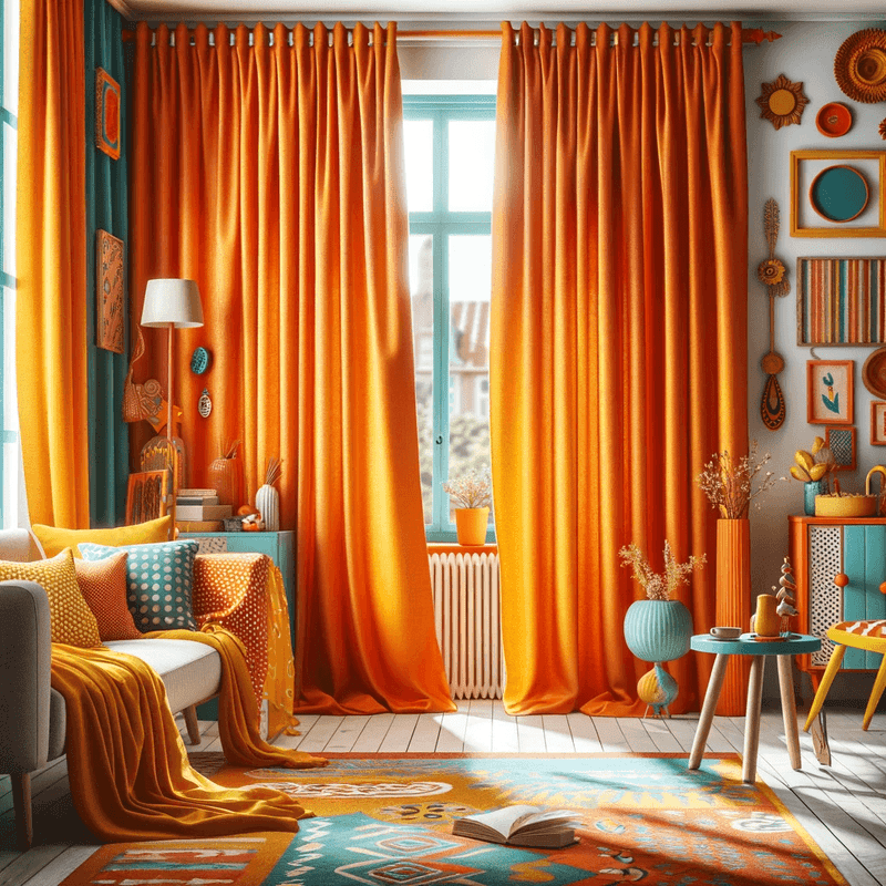 Curtains by colour
-
 Sheers by colour
-
 Blinds & Accessories
-
-
Household linen
-
 Bedding
-
 Throw Blanket
-
 Sofa Cover
-
 Table Runner
-
 Shower Curtain
-
-
Decoration
-
 Macramé
-
 Ceramic Vase
-
 Light Garland
-
 Wall Clock
-
-
Rugs & Flooring
-
 Rugs
Rugs
-
 Wall Tapestry
-
 Doormat
-
 Shade Sail
-
-
Blog


We use cookies and similar technologies to provide the best experience on our website.
Saturation
Definition
Saturation refers to the intensity of a color, from the most vivid to the most muted. A desaturated color is softer, a saturated color is more vibrant. Playing with saturation helps balance a palette and create visual hierarchy.
Learn more about Saturation
Saturation is an essential element to consider in your color palette for successful interior decoration. It allows you to create harmonious and balanced spaces. A highly saturated color will bring dynamism and vitality, while a desaturated color will be more soothing and refined. You can thus play with these different saturation levels to guide the eye and create visual hierarchy in a room. For example, you can use desaturated hues on the walls to create a neutral background, then enhance the whole with a few touches of vibrant colors on textiles or accessories. This subtle play of contrasts will energize your interior while maintaining a warm and balanced atmosphere. You can also opt for a monochrome palette by varying saturation levels, from lightest to darkest, for an elegant and contemporary look. Thus, mastering saturation is a true key to developing your creativity and signing off on personal and successful decor.
Related to Saturation
Interior Decoration
Explore our carefully selected products to enhance your interior.
View collection →Frequently Asked Questions
Use saturated colors for accents and desaturated colors for large surfaces.
Saturation measures pure intensity. Brightness measures lightness (close to white or black).
Add gray to your colors, or neutral tones. Natural materials visually desaturate.
Saturation refers to the intensity of a color, while color itself refers to the hue (shade). A saturated color will be more vivid and intense, while a desaturated color will be duller and grayer.
The ideal saturation level depends on the desired ambiance. For a relaxing room, opt for softer, desaturated colors. For a dynamic room, go for more saturated and intense colors.
A room with highly saturated colors can appear smaller and more enclosed. Conversely, more desaturated hues can give an impression of a larger, airier space.
To create balance, play with contrasts by combining saturated and desaturated elements. Use highly saturated areas to draw attention and low saturated areas to create visual rest.
Avoid using too many highly saturated colors, which can be tiring for the eyes. Prefer a balanced mix of saturations to achieve a harmonious and restful palette.
Share this definition
Related terms
Les avis de nos clients
Our Collections
Explore our world of home decor


Our Best Sellers
Our customers’ favorite products


Get our decor inspiration
Trends, tips and exclusive offers delivered straight to your inbox.
No spam. Unsubscribe in one click.
Free Delivery
In mainland France
Secure Payment
Card, PayPal, Apple Pay
Responsive Customer Service
Reply within 24h
Some advice
- How to whiten curtains?
- How to clean a shower curtain?
- How to Make Your Curtains Stand Out?
- What kind of curtains for a blue bedroom?
- What curtain with a blue sofa?
- What color curtains for a gray living room?
- Why are theater curtains red?
- How to choose the color of your curtain rod?
- Should new curtains be washed?
Welcome offer
Get 5% off your first order
Sign up to our newsletter and receive your promo code by email — plus our home decor tips and exclusive sales in your inbox.
Thank you! Here is your code
Click to copy
Code copied to clipboard!
Use this code at checkout to enjoy your discount. The code has also been sent to your email.
Shop our products